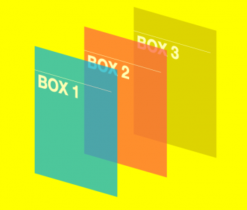
Now we are in the most interesting part of the transformation, in CSS3 3D Transformations. Before entering into any properties that we can play later, there is little notepads;
- In this paper I will discuss about prefix -webkit. For another prefix that I did not include in this paper, but in my demo code included.

- Forget IE9 down. Transformation can be applied to any other browser.
3D objects in a 2D screen, Can?
Could, in the form of 2-dimensional, we play in a specified field in a flat horizontal position (x-axis) and vertical (y-axis). In the 3-dimensional shape, in addition to the two axes before we got the z-axis. Z axis gives the depth of field we have, so we do not play in a flat plane instead of space.
Suppose we now have a display value of z = 0, then the object with z + will advance from the screen towards you and the object with the z-will fit into the screen away from you. If we add the property perspective, the object will be seen to disappear as the object distance.
There are some important points you should know:
1. We transform the two-dimensional elements into 3 dimensions. HTML boxes remained flat and has a depth of zero. Although you do scale element in the z direction, basically the elements will not expand. Seperto scale circle you will not turn into a cylinder.
2. When the 3D transformation is done on an element, all the elements in it to follow.
3. Play a 3D Transformation is very easy. Elements can be suddenly lost somewhere behind the scenes or out of the display area. I suggest to undo redo your current coding matters worse.
We start with one simple step :
<div id="container">We have the outer form of the container element that contains 3 pieces box. I give a little style in order to understand this better visualization. The outer container is not particularly have to be made at this time, but it will be done a bit of rotation on the whole box, thus giving better visualization.
<div id="box1"> BOX 1</div>
<div id="box2"> BOX 2</div>
<div id="box3"> BOX 3</div>
</div>
First, we will apply translateZ in the third box. We make boxes 2 and 3 go into away from us. Like this :
#box2

{transform: translateZ(-300px);}

#box3

{transform: translateZ(-600px);}

The result is like this. Hmm, not what we expected. In the shadow we have given a negative value so box2 and 3 should stay away from us and the most distant box 3. The opposite happens, box 3 is the most in front of the other. Why is that? It is caused by a transform-style property which by default has a value of flats. To overcome this, we change into a preserve-3d so that the elements we have depth.
#container

{transform-style: preserver-3d;}

Unfortunately, in the transform-style IE10 can not be used, so box3 will remain on top of the other box. Yes hoping and praying together just for you fans of IE, Microsoft may overcome this problem in IE11. Ok, outside of IE10, we are getting closer to the peak of our victory, then Let's get some perspective!
Perspective
In the previous results (see image), we seemed to be in front of the stage and saw the third box. Same great and looks piled one and other. That's because the object is in line with the three of us in front of the stage. Let us give perspective to our view.
#container

{transform: rotateX(-20deg) rotateY(-40deg);}

Yep, now we like to sit on the right and see the area in front of the stage. Seen not just one box, but the box is lined 3 Paskibraka beautiful as our first school age.
We can also add a bit of perspective effects so visible object which is farthest away.
#containerThe result was like this, the most visible object is much smaller than the object in front of him.
{transform: rotateX(-20deg) rotateY(-40deg) perspective(1300px);}

The greater the value of the function is entered perspective the farther we look at these elements. Imagine if we were in the VIP section at a classical music concert, we're at a value perspective = 0. When raised to 1000px, we were in the lowest class, festival or economically possible to see the stage even as all objects look as great.